Introduction
MultiSync Made Easy is a brand asset of HIC Global Solutions and a popular name in the native ETL Solution Tool
To keep our brand image strong and distinctive, we’ve established guidelines for the design team
and partners to use the logo correctly in all future campaigns. Let’s keep our identity intact
and make sure it stands out!
We advise you to go through the document carefully while using our logo for all business
purposes.
Brand Identity Guide
Thank You For Reviewing The Document
The guidelines in it will help us maintain graphic and message continuity, protect our logo
assets, and build powerful, relevant messaging across a variety of platforms when used
appropriately.
Why Is This Necessary?
Proprietary logos, approved typefaces, the visuals we choose, and the words we use — every part
of our brand is an important part of our whole brand. That’s why it’s extremely important that
we use each very carefully.
Following the guidelines and rules in this style guide will help us speak with a single,
influential voice to generate bold, engaging communications, build strong bonds with our
audiences, and protect our brand for years to come.
Brand Voice
Our corporate logo represents the value we bring to our organization and communicates the
identity of MultiSync Made Easy.
Our logo conveys that we are
Brand Logo Types
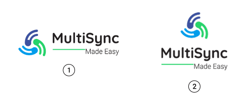
The MultiSync Made Easy logo comprises our brand name and the tagline set in Quicksand. We prefer using our primary logo in most instances. Please follow the instructions in the guide for the correct usage of our logo.
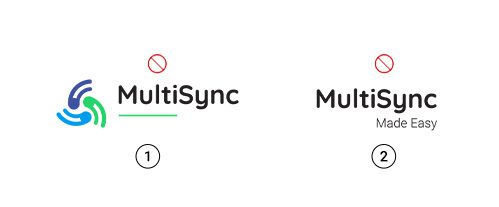
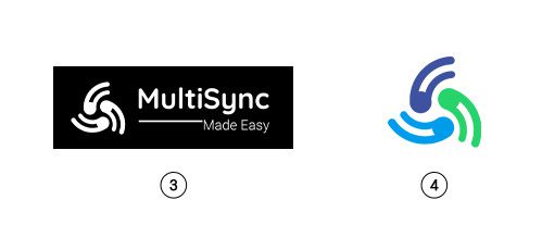
Correct Way To Use MultiSync Made Easy Logo
Primary Logo
Alternate Logo
Correct Way
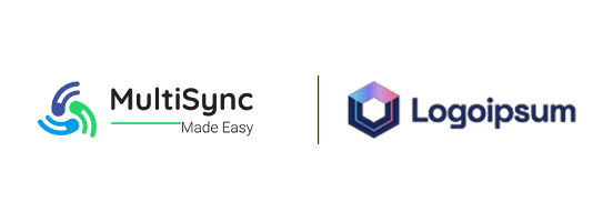
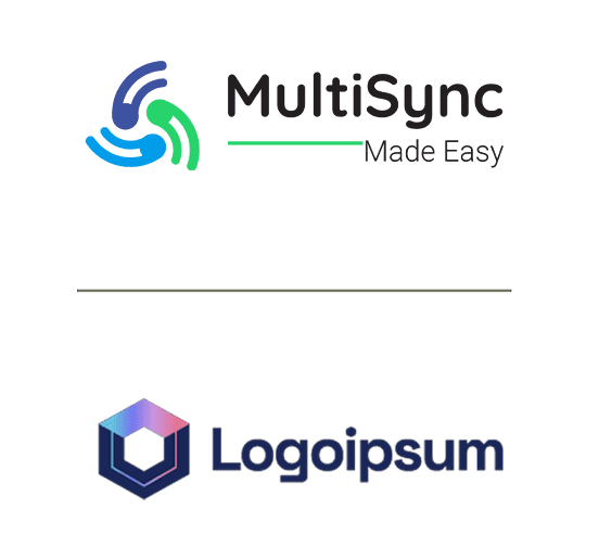
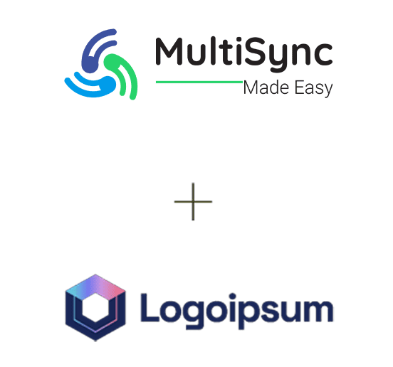
Co-Branding
While using the logo, Please Make sure the materials you use are current and reflect MultiSync Made Easy as it stands today.
Partnering with a third party may require us to use a co-branded logo. The logo is composed of
three elements: the primary brand logo, a dividing line or “| or +”, and a third-party logo. It
is important that the logos are equal in size.
Please note that we allow third parties to use our logo only after specific permissions.